As a whole, lawyers are very literal, often too literal for good marketing. As a result, many firms simply opt for the obvious icons that represent the general concept of “Law,” just like most of their closest competitors. The logical rationale seems to be, “Well, if everyone else is doing it this way, it must be right.” But that’s wrong.

Your marketing should set you apart, help you stand above the crowd. And doing exactly what they do buries you in the anonymous middle. Sure it’s safe, but ”safe” doesn’t help generate revenue.
That is, if your website home page shows a skyline or column, you’ve immediately convinced everyone who sees it that (1) your firm is mediocre, and (2) there’s nothing worth reading inside. If you want to claim to be a high-end, A-tier firm, then you must look like it, and a photo of a handshake, map, or pen resting on a document won’t cut it. No exceptions, unless you’re, say, Wachtell or Cravath.
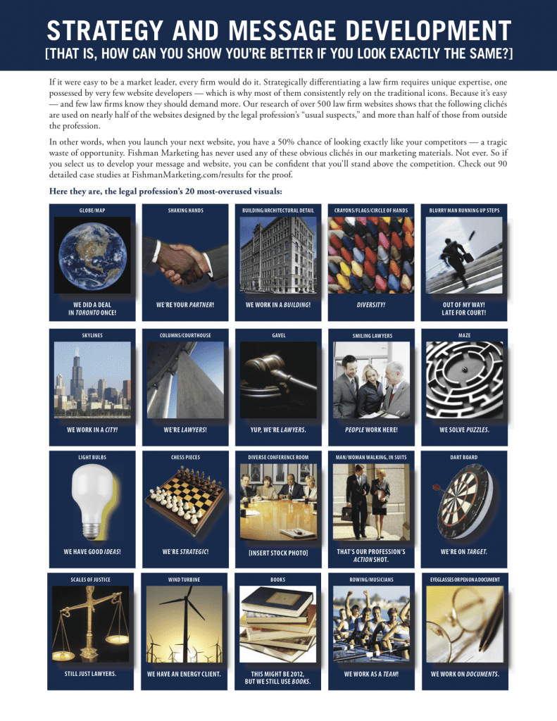
So here they are, the 25 most typical and tedious clichés law firms use (and what they actually convey to the average reader):
The Image (What it means.)
- Globe/Map (We did a deal in Toronto once)
- Shaking hands (We’re your partner.)
- Building/Architectural detail (We work in a building!)
- Skylines (We work in a city!)
- Columns/Courthouse (We’re lawyers!)
- Gavel (Yup, we’re lawyers.)
- Light bulbs (We have good ideas.)
- Chess pieces (We’re strategic.)
- Diverse conference room (Stock photo)
- Smiling lawyers (People work here!)
- Scales of justice (Still just lawyers.)
- Dart boards (We’re on target.)
- DNA/Test tube/beaker/gears/CD (We have an IP practice.)
- Man/Woman walking, in suits (That’s our profession’s action shot.)
- Vacant lobby/Conference room (We go home at 5:00.)
- Books (This might be 2012, but we still use books.)
- Laptop/Computer (Look! We use computers!)
- Eyeglasses or pen on a document (We work on documents.)
- Boxing gloves (We’re tough.)
- Rowing/Musicians (We work as a team!)
- Crayons/Flags/Circle of hands (Diversity!)
- Grinning PI or divorce lawyer (Lost a limb? Wife left you? Good for me!)
- Cheetah (We move fast.)
- Maze (We solve puzzles.)
- Blurry man running up steps (Out of my way! Late for court!)
The fact that you immediately recognized all or most of these, and perhaps laughed embarrassingly at a few, proves that these images have lost their impact. So, if you’re using any of these in your marketing materials, from website or blog to print ads or brochures, stop immediately.
Either change your tag line to “Average skills. Average price.TM” or, preferably, come up with something that really sets you apart. Create something else, something great. Something that helps you stand out in a way that generates real revenue. If you can’t do it, hire someone who can. But it must be done, it’s important.
Figure out who you really are, then build your marketing around that.


 />i
/>i

