Perhaps nothing has a larger bearing on risk management than the future of the economy. Corporate revenues, insurance pricing, staffing and perhaps even social unrest all hinge on a continued recovery and all the (relative) progress made since 2008 could be washed away by a receding economic tide if, say, the euro zone crisis deepens or the U.S. economy double-dips back into recession.
But, really, who has the time to understand the economy? I barely passed high school math and now I’m supposed to figure read the tea leaves of a $16 trillion greenback trail? Please. Can’t someone just tell me what’s happening as if I’m a third-grader?
Oh. Why thank you, Wall Street Journal and Goldman Sachs. (via @WSJ)
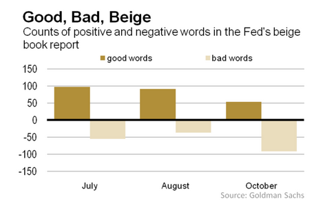
The chart below is pretty self-explanatory — and fairly alarming. I’ll let them explain.
Wall Street loves numbers — always has, always will. That makes the Federal Reserve’s periodic beige book report (a/k/a “Current Economic Conditions by Federal Reserve District”) a bit frustrating. It’s all words: “Economic activity generally expanded modestly since the last report,” the latest version said. So is that good or bad? More or less? A lot or a little?
Enter the clever economists at Goldman Sachs: They have turned the Fed’s words into numbers. “Our approach is simple,” this said this week. “We compile a list of ‘good’ and ‘bad’ words frequently used in Beige Books to describe economic conditions and search historical reports for their relative occurrence over time. Although very simple, this word-counting exercise allows us to interpret the qualitative information in the Beige Book quantitatively.”
Simple? Sure. Then again, so am I.


 />i
/>i

