“There are no new ideas.…”
 I get that.
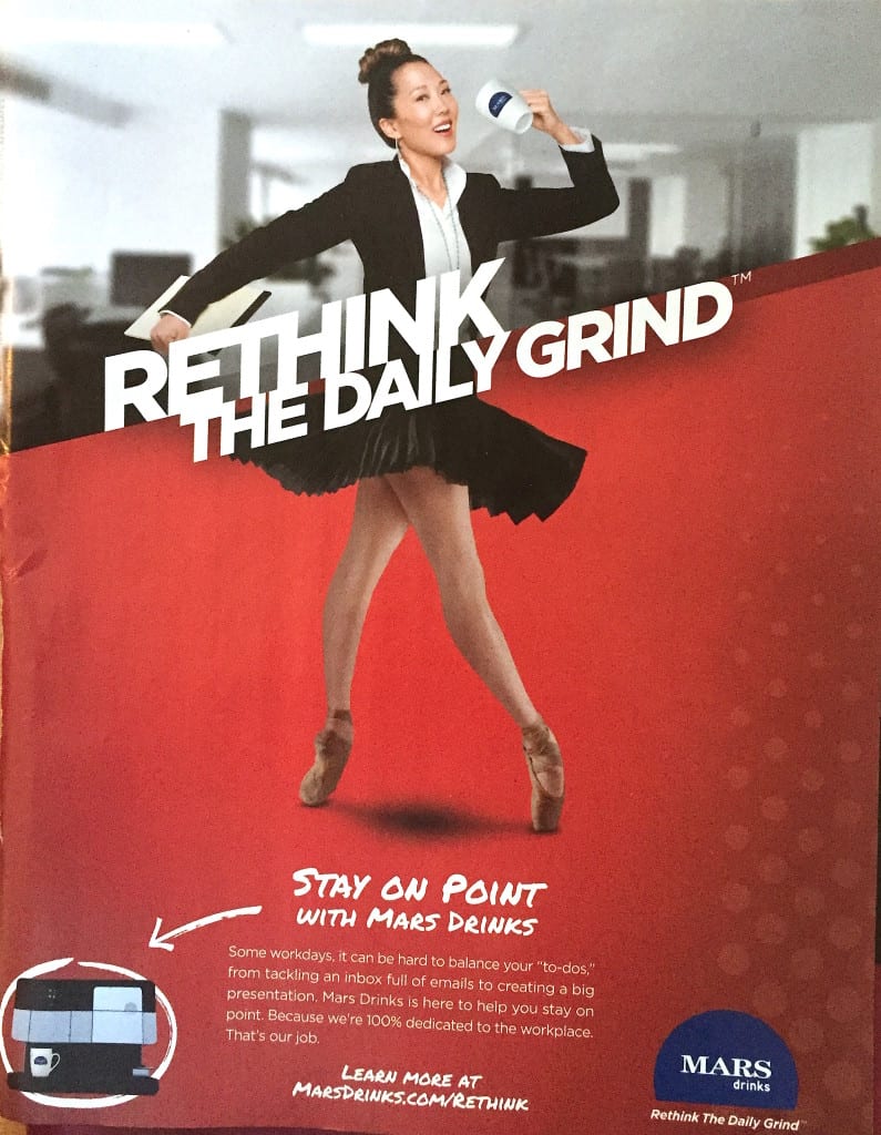
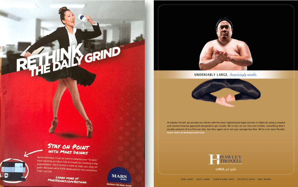
But I did a double-take after seeing this ad in Wired magazine’s November 2015 issue. We developed this same idea a couple years ago for the largest Idaho-based law firm, Boise’s Hawley Troxell.
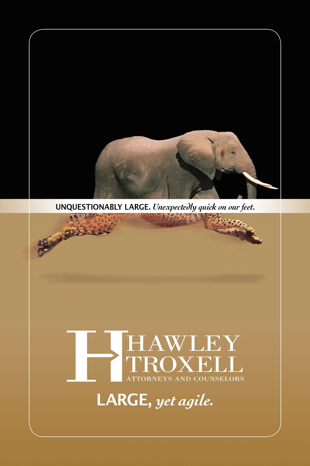
Our “Large, but agile.” message was that Hawley Troxell is not just the biggest and oldest firm in town, offering the most depth, breadth, and specialty practices, but that the lawyers remain quick and nimble (to deflect the negative whispering of their smaller competitors).
To make that point visually, we horizontally sliced two very different things in similar categories, e.g. an elephant and cheetah, or a sumo wrestler and ballet dancer. It created striking images that really grabbed readers’ attention and told the story with a quick glance.
The coffee maker’s execution seems clunkier, using a strained pun, showing ballerina on her toes, actually “en pointe,” above the “Stay on Point with Mars Drinks.” It’s all just working too hard (“Get it? Huh? Get it? ‘On Point?’ ON POINT???”). It doesn’t really connect to the product or message; it’s the type of idea common in the student portfolios of advertising majors.
These heavy-handed puns are a quite popular, if too-obvious direction.

Of course, the visual does generally catch your attention. It would have been more effective if they’d worked a bit harder and knocked out the distracting office background — there’s just too much going on visually . Contrast that to the power of our simpler solid-colored backgrounds.
And, of course, the ad agency was probably forced to show the coffee maker. It’s nearly impossible to persuade a manufacturing company to let you skip the obvious product shot. And highlighting it further with a “hand drawn” arrow and circle? Additional over-emphasis typically demanded by the Marketing Committee (“Make the logo bigger!”).
But doesn’t our cleaner, simpler original version grab your attention much better?


 />i
/>i


